Written by Sarah-Anne
What do you get when you cross a knight, a jack, and a queen?

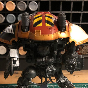
The past week I was given an interesting opportunity; take an already assembled and painted model (in this case, a super epic one!) and to "Jacksify" it for our local game store. Once finished, it would be brought to a Warhammer 40,000 tournament to become part of the 'wooden spoon' for last place. Though there was nothing wrong with the original paint job, the colour-scheme needed to be simplified to match that of the store and I wanted to experiment with some of the details to add some more visual interest.
In order to paint over the model while still keeping many of the original elements, I decided to give it a couple coats of matte sealant. However, I knew years of sitting on a shelf and being touched over and over was likely to leave layers of oil, dust, and grime, so it needed a good wash in warm soapy water. This also helped to take off all the loose snow flocking on the base, which would flake off every time it was touched!

Once the model was perfectly dry I was able to give it the coats of sealant, and start painting!
The first thing I needed to do was simplify the paint scheme. I painted over any area that wasn't silver, white, black, red, or gold, while leaving the existing silver areas as-is (besides adding black to the tips of the gun barrels).
The main armour sections were already red but they were much more orange than true red and not quite the right colour for the store's logo. A few thin coats of crimson corrected that nicely.


Next I decided to try repainting over a couple of the existing skull decals to make them a little more interesting.


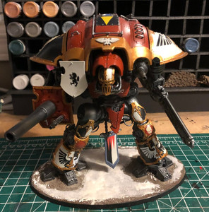
Though I've done small attempts at true-metallic-metal before, never on this scale. There are many areas that could be smoother and some areas that the highlights aren't quite... right, but overall I'm quite pleased with the difference it made on the model. I used Army Painter Bright and Greedy Golds, Matt White for the highlights, and Liquitex Sepia Ink for the shadows. Next time I think a white ink would be more effective for the highlights.


I am especially pleased with how the TMM ended up around the cannon. Again, not the smoothest of blends, but still effective.

Now for the most important part: the stores logo!

Finally I had to tackle the base. I wanted to honour the original creator and their idea of a snow-covered battlefield, and the cool tones of the base would be a good contrast to the red and gold of the Knight itself. I mixed some Army Painter snow flock with Matte Mod Podge and gave it a nice thick layer, and added some 'ice blocks' by painting pieces of XPS foam insulation in shades of blue and white, and then covering in Vallejo Water Texture.

To continue the winter theme, I cut small triangles out of clear plastic sheets and after super-gluing them to the model, covered them in more Water Texture to build up the icicle shape.

And it was done! Here are some before- and after-comparisons:


Comments